What is an ECDF anyway ?
Motivation
A few years back my colleague introduced me to ECDF’s while doing some Time Series analysis. I quickly realized there elegance. This post is my attempt to pay it forward and would consider this post a success if at a bare minimum you are able to read an ECDF plot by the end of this post.
Prerequisites
I am presuming that the reader has somewhat familiarity with probability theory and understand what a Cumulative Distribution Function (CDF) is.If you don’t, then try to skim the parts you don’t understand and focus on the applied part.
Problem Statement
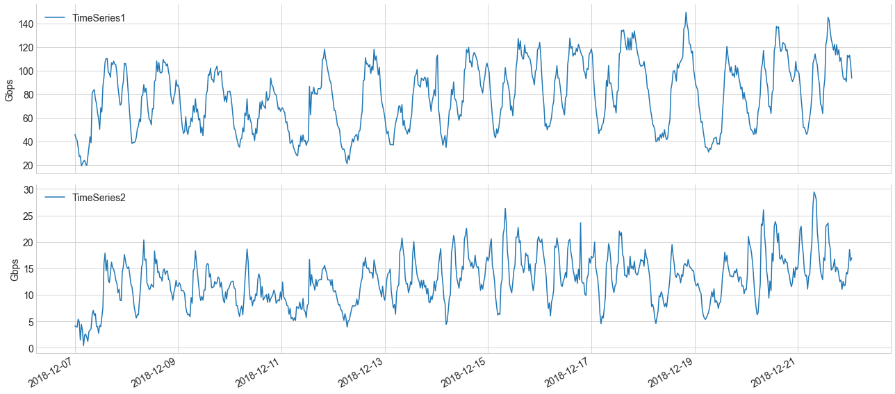
We as Network engineers see Time series almost every day in our lives.Let’s say we have two made up time series (Fig.1) which represents egress traffic of router interfaces.Just by looking at it, various observations can be made. In this post, we will like to summarize things like:
- Use ECDF to look at various percentiles like what is the 99th or 95th percentile of the traffic we observe.
- How does an ECDF looks like when the traffic is bi-modal.
- Use ECDF’s to compare two separate time-series.
What is an Empirical Distribution Function (ECDF)
An ECDF is basically a non-parametric estimator of the underlying CDF of a random variable.The difference between a CDF and ECDF is how probability measures are used. In case of an ECDF, the probability measure is defined by the frequency counts in an empirical sample. In other words, ECDF is the probability distribution which you would get if sampled from your set of observations.
Note: a Non-parametric estimator makes no assumption on the distribution.
Mathematically you can denote ECDF as
\[F_{n}(x)=\frac{1}{n}\sum_{i=1}^{n}1\{X_{i} \leq x\},\\ where 1\{X_{i} \leq x\} = \begin{cases} 1, &X_{i} \leq x \\ 0, & otherwise\end{cases}\]You will notice many books will use Indicator function in the notation, which is basically a compact notation of the above.
Let’s assume that we have n observations. An ECDF, assigns a probability of 1/n to each observation, sort them from smallest to largest, and then sums the assigned probabilities up to and including each observation.
For instance, lets take a look at a simple example:
import matplotlib.pyplot as plt
import numpy as np
# generate 100 observations from a normal distribution with loc = 100 and size =1.
obs = np.random.normal(100, 1, 100)
# sort the observations in increasing order
x = np.sort(obs)
# size of the observations
n = len(obs)
# divide each datum by 1/n
y = np.arange(1, n+1)/n
# ECDF plot
fig, ax = plt.subplots(figsize=(12,4))
plt.plot(x,y)
This gives us a sample ECDF
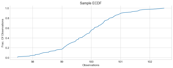
You can make few observations like:
- Majority of the valus are between
98to102on x-axis. - Graph is centered around
100on x-axis and corresponding y-axis seems to be~0.5. This is actually your \(50^{th}\) percentile(median).In this case it’s also the mean as you recall we generated observations with mean \(\mu = 100\)
Let’s explicitily mark the graph with \(50^{th}\), \(95^{th}\) and \(99^{th}\) percentile.
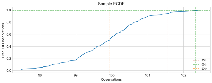 Orange line, shows \(50^{th}\) percentile which is
 ~100
Red line, shows \(95^{th}\) percentile which is ~101.5
Green line, shows \(99^{th}\) percentile which is ~102.3
ECDF for Sample Time Series
By this time hopefully, you had some intuition on what an ECDF is and how to read it. Now let’s take a look at the ECDF’s for our two made up time series and there \(95^{th}\) percentile.
Our sample time series

ECDF of our sample time series
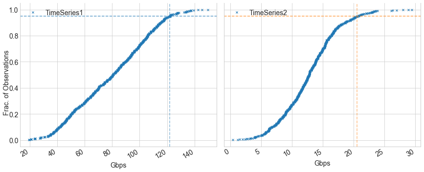
You can see that \(95^{th}\) percentile for Time Series1 and Time Series2 is ~122Gbps and ~20.5Gbps respectively.
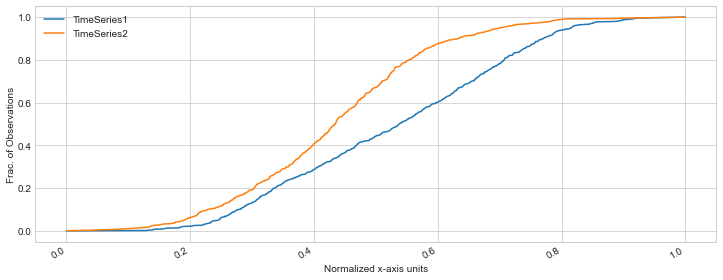
Another observation you can make is the difference between the shape of the curves. TimeSeries1 ECDF shape is less steep
compared to TimeSeries2 ECDF. This indicates that traffic is increasing more steadily in TimeSeries1 compared to TimeSeries2.
To make this comparison easier, we could plot both ECDF’s together, but we have to normalize there x-axis units first as they are on different scales. we can normalize both timeseries x-axis units between 0 and 1 and then do a visual comparison.
ECDF comparison of two Time Series
Bimodal Traffic
In statistics, mode is basically the term used to refer the set of observations which appears most often. For example, as you know in a Normal Distribution it’s the mean which is the peak of the distribution.Bimodal basically means there are two sets of observations which appears most often, which will translate into two peaks.
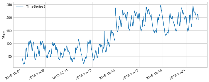
For example, let’s assume we have this TimeSeries which represents the case where traffic suddenly increased for whatever reason.You can see that traffic was centered around 50-100Gbps and after increase, it centered around 150-250Gbps.Though many times in real life data may not be that clear.
Sample TimeSeries
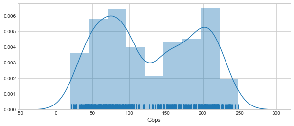
If we try to estimate the underlying distribution of the above timeseries, You can see two peaks with one centered around 50-100
and the other centered around 200-250Gbps.
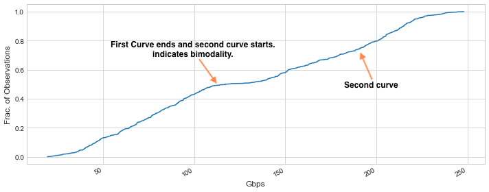
Below is how an ECDF will look like for a Bimodal traffic.
Conclusion
We started this post with the motivation, did a quick introduction of ECDF and then looked at some examples of ECDF’s for sample timeseries and ECDF comparisons. We also looked at how one can detect bimodality with ECDF’s. At this point I hope that the reader should have developed enough understanding to be comfortable enough in reading an ECDF plot. I hope that you find this post useful.